
Market Outlook - June 2021
There is an old saying among market pundits, “Sell in May and go away until Labor Day.” This refers to the market historically under-performing during the summer months because most investment managers are on their yachts or in the Hamptons at their beach houses. But does the saying really match reality?
From Yardeni Research, here is the monthly average return of the S&P500 from 1928 through 2021:

Yes, historically, May has been meh from a return perspective, but the remainder of the summer months have all performed fairly well, especially July.
What history also tells us is that the primary trend going into a seasonal quarter (February, May, August, and November) tells a more important story in the short run than the overall history of the market.
Let’s take a look at a few charts to see what the data is currently telling us.
S&P 500
At the Market Outlook event, our conclusions were that short term things looked messy for the equity markets but the intermediate to longer term outlook was favorable. Nothing that has happened over the last month has really changed that outlook.
Below is a weekly 1-year chart of the S&P500. The primary trend is still intact, but we have had some consolidation going on over the last several weeks. Markets tend to correct in one of two ways – via price or via time. Currently, it looks like the S&P is correcting via time. Score one for the bulls.

Growth vs Value
Below is the chart that we discussed in the Market Update Webinar. This is the ratio between Growth Stocks (represented by the Russell 1000 Growth ETF) and Value (represented by the Russell 1000 Value ETF). If the chart is trending upwards and to the right, it means that growth stocks are outperforming value stocks on a relative basis. If it is trending downwards the reverse is occurring.
Growth has outperformed for close to 12 years, but the trend has changed recently with value outperforming. As long as the ratio is below that black line(1.69ish), Value should continue to outperform Growth. Another interesting number is 1.55ish, where I drew the second black line. This looks like an intermediate area of support for growth. If growth drops below 1.55, then value’s outperformance should pick up speed.

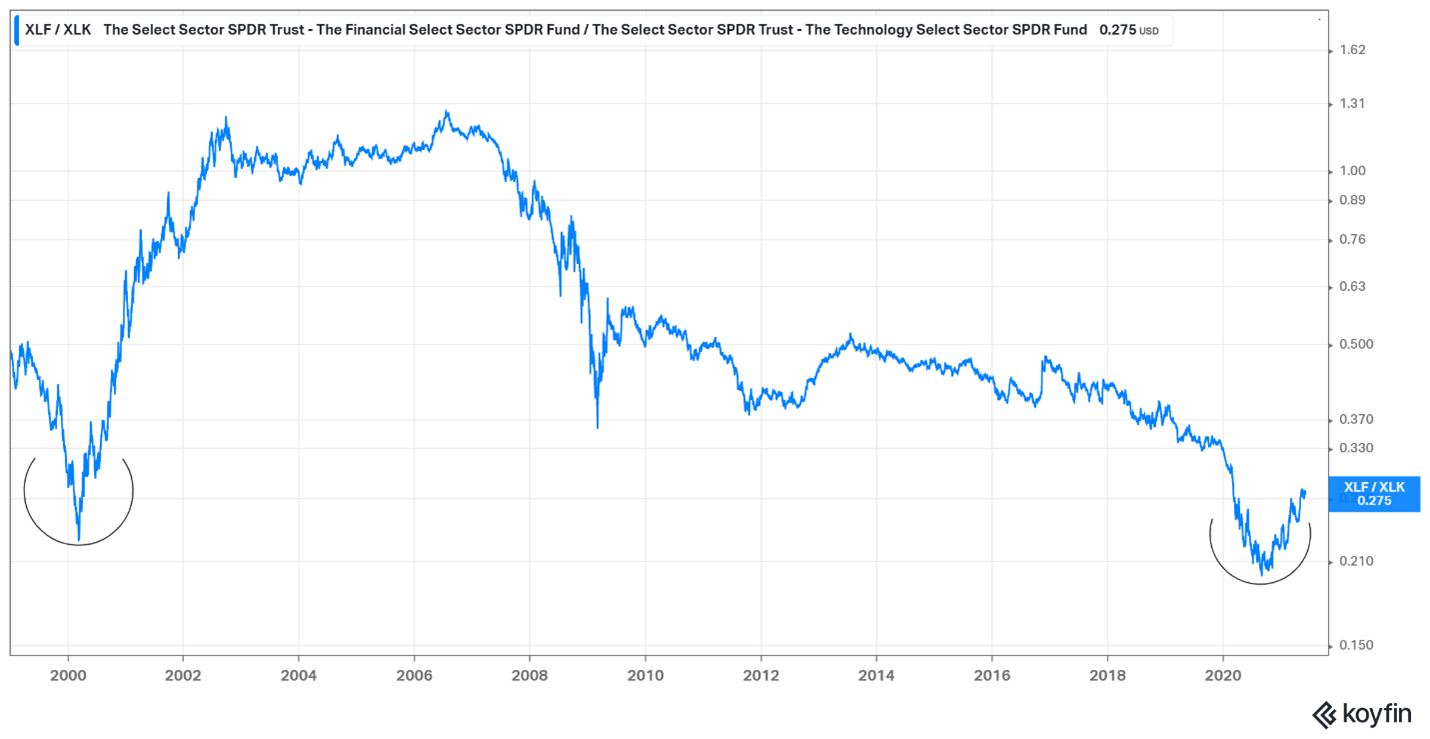
Financials vs Technology
The last chart we will discuss is a 20-year chart of the ratio of financial stocks (represented by the XLF ETF) versus technology stocks (represented by the XLK ETF). When the trend is going up, financials are winning relative to technology and when the trend is down, the reverse is occurring.
Technology’s outperformance has been ongoing since 2007. The two smiley faces on the chart represent major turning points in the trend where financials began to outperform technology over a significant period of time. The first occurrence was in 2000, and it is possible the second happened last year. To quote technician JC Parets of Allstarcharts.com, “We want to be buying smiley faces and selling frowny faces.”
We will continue to monitor the data points through the summer and coming months. While we do that, I hope everyone is enjoying some renewed freedom to movement and spending time with family, friends, and good food.
- Mike